The Statistical Office of the Canton Basel-Stadt published a visualisation of the landcover of the city’s neighbourhoods. Termed “Quartierfarben” (German for “neighbourhood colours”), the project is grounded rather in art than in scientific data visualisation, but not a bit less intriguing for it. The “Quartierfarben” are published as an interactive web app and as a piece in a printed magazine “Dossier Basel”1 and its pdf version.
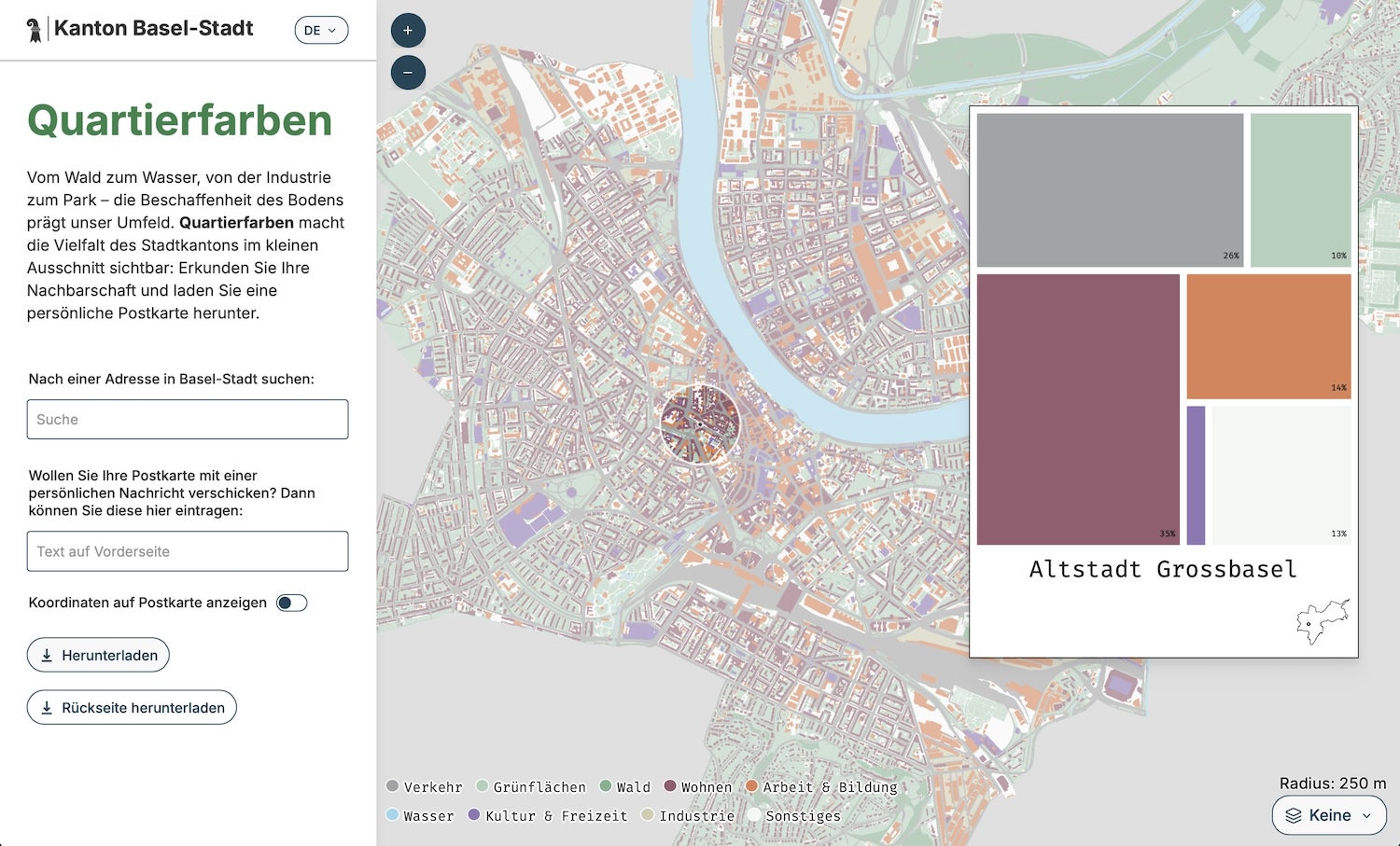
The “Quartierfarben” distinguish traffic, green areas, forest, residential areas, work & education areas, water, culture & leisure areas, industrial areas and other landcover types. The web app allows you to explore the landcover of the different neighbourhoods of Basel interactively and then to create (and download, not send) a postcard for a location of your choosing. I find this a very neat approach to make (sometimes quite abstract) data explorable and eventually tangible.
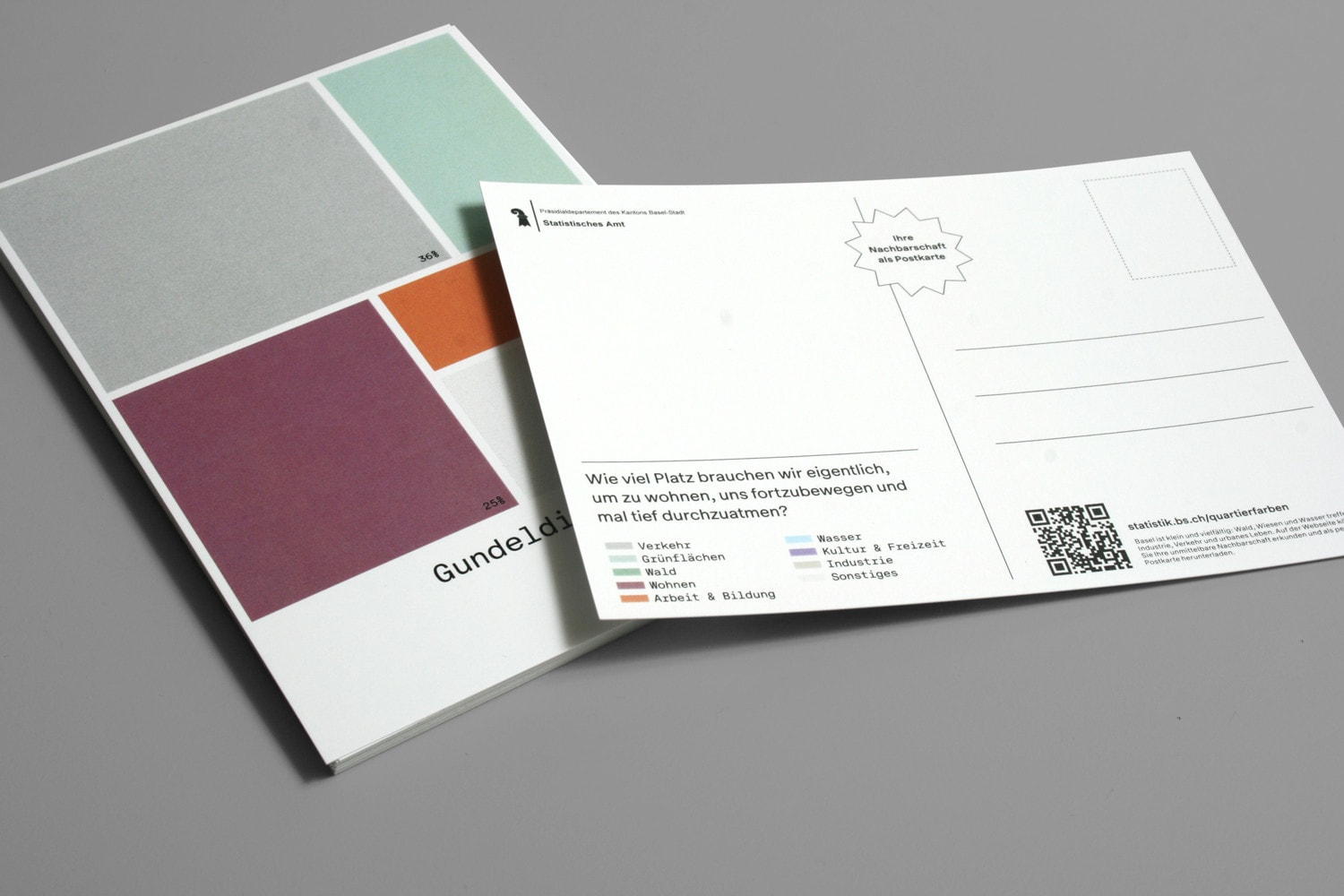
The whole project builds on (and extends) “Grätzlfarben” (by the Technical University of Vienna) and “Kiezcolors” (by ODIS Berlin) which have done a similar analysis and visualisation for Vienna and Berlin, respectively. The code for the “Quartierfarben” is open-source under the MIT license on GitHub.
Footnotes
Minuscule footnote: Oddly (to me), this magazine of the Statistical Office is sold / has a paid subscription. This reminds me of an event organised by the office that also charged an entry fee, which surprised me a lot from a cantonal institution.↩︎