From Stamen1 comes a blog post that explains what they call their “Philosophy on Dark Mode Maps”, portions of which were presented at the 2025 NACIS2 Annual Meeting. The trend to “dark mode” in tech is long-standing and undeniable – but what does it mean for digital maps?
We’ve made a lot of dark maps over the years at Stamen. We’ll often see dark maps from other designers or commercial providers and think, “why so dark?” We have a philosophy around designing a dark map for a particular client or use case, but we haven’t ever really spelled it out – either internally at Stamen or with the larger cartography community. It’s always been very, “it’s hard to describe, but I know it when I see it,” which is not the most useful!
The blog post describes how Stamen approaches the design process for creating dark-mode cartography. The authors for example elaborate on the distinction of “night mode” (low contrast dark maps) and “daytime dark mode” (high contrast dark maps), treating them as subgenres within the category of dark-mode maps. The post illustrates the design principles and thinking that went into them using several examples of map styles from Stamen’s portfolio and others. Finally, the authors introduce an interesting scatterplot technique to analyse map color palettes by plotting pixel counts based on their hue and lightness values. These scatterplots can distinguish “shifting” vs. “mirroring” approaches to creating dark-mode maps.
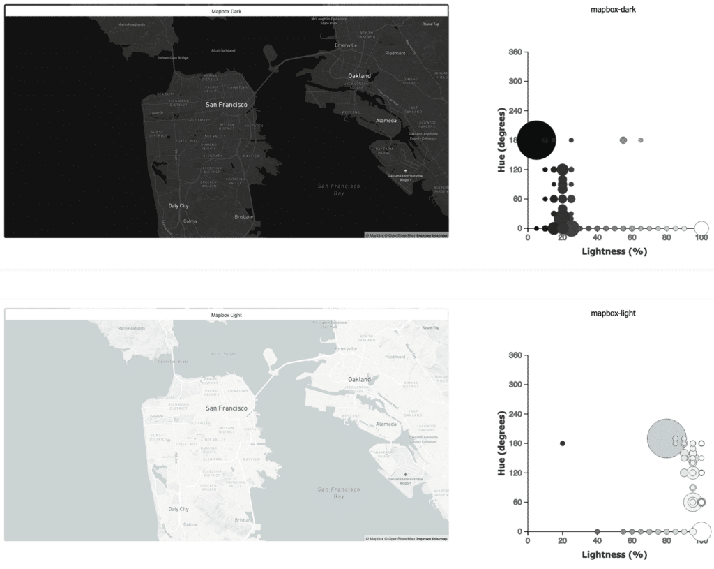
 and Protomaps (bottom) dark and light base maps using hue-lightness-scatterplots (source: Stamen)")
Footnotes
Stamen is a data visualization and cartographic design studio in San Francisco. You may know some of their web map styles, for example “Toner” and “Watercolor”.↩︎